Mar 5
The Problem: When Your AI Coding Assistant Can’t Find the...

Feb 19
In enterprise technology, values are often treated as window dressing....
Feb 19
We’re in an era where nearly every consulting firm promises...
Feb 19
I’ve spent the last decade watching insurance carriers chase the...

Feb 19
We often talk about architectures, methodologies, and tools in IT...
Feb 19
Modernization has become a constant in enterprise tech. Every organization...

Feb 19
Application development is often blamed for many modernization failures, missed...

Feb 19
AI is everywhere in enterprise conversations right now. Boards are...

Feb 19
Every AI vendor is promising transformation. The smart CIOs and...
Feb 19
Too many executives are still defaulting to staff augmentation when...

Feb 19
We talk about data like it’s an asset. In practice,...
Feb 19
Most transformation efforts don’t fail in design. They fail in...
Feb 19
It’s one thing to say “Copilot helps us work faster.”...

Feb 19
Year-end reviews are in full swing. Revenue performance. Attrition rates....

Feb 19
Everybody loves the promise of AI. Automate the grunt work....

Feb 19
Every organization I work with wants to move faster. Executives...

Feb 19
Competitive advantage isn’t just tech, it’s learning. And in an...
Feb 19
Transformation is a buzzword until someone has to use the...
Feb 19
Every CIO wants to move faster. But the hard truth...

Feb 19
In large-scale transformation efforts, it’s easy to feel optimistic at...
Feb 19
Over the past year, I’ve sat in dozens of rooms...

Feb 19
Most transformation programs don’t fail because of tools. They fail...
Feb 19
Great tech leaders are stepping away from the illusion of...

Feb 19
DevOps is still misunderstood in too many client environments, and...
Feb 19
Every consulting pitch talks about transformation. Few talk about trust....
Feb 19
There’s a myth that legacy systems are a problem because...

Feb 19
Every fall, enterprise leaders across industries engage in the same...
Feb 19
One of the most difficult decisions I’ve made in leadership...
Feb 19
Ask any CIO or CTO what they want in a...
Feb 19
In enterprise transformation, progress is rarely the bottleneck. Most teams...

Feb 19
The phrase I keep hearing this quarter: “We have the...

Feb 19
Most modernization efforts stall for the same reason. They’re too...
Feb 19
Legacy technology is often viewed as a liability. But in...

Feb 19
In November 2023, we published an analysis of Microsoft Fabric...
Feb 19
Modernization is hard. We know this because the same patterns...

Feb 19
2026 will likely be one of the busiest years for...

Feb 19
By now, every technology and business leader knows they need...

Feb 19
Every conversation about insurance technology right now seems to lead...
Feb 19
Everyone in insurance loves talking about analytics, AI, and “data-driven...
Feb 19
The AI noise is deafening. Everyone’s got a new model,...
Feb 19
In high-stakes delivery environments, the instinct is often to tighten...

Feb 19
There’s a pattern I keep seeing. Executives greenlight AI initiatives...

Feb 19
In theory, innovation should move fast. In practice, it often...

Feb 19
In the race to modernize, governance often gets framed as...

Feb 19
Let’s be honest. GitHub Copilot landed like a magic trick....
Feb 19
In Atlanta’s insurance and banking sectors, many PMOs are still...

Feb 19
The retail banking sector is approaching an inflection point. As...

Feb 19
January brings the predictable surge of activity. Firms are back...
Feb 19
Too often, execution is treated like a baton pass. Strategy...

Feb 19
Everyone talks about technical debt like it’s the monster under...
Feb 19
Many companies are rolling out their 2022 strategic plans in...
Feb 19
Data productization is gaining momentum, especially in banking and financial...

Feb 19
Let’s get real. Going live isn’t the finish line. It’s...

Feb 19
Cloud has been framed as the answer to every modernization...

Feb 19
The “ALM is dead” narrative is lazy. The reality: application...

Feb 19
I’ve been in multiple boardrooms over the past year where...
Feb 19
Everyone wants to talk about AI strategy right now. Execs...
Feb 19
Right now, boardrooms across the country are echoing with this...

Feb 19
Everyone’s investing in AI. Few are investing in the organizational...
Feb 19
The enterprise AI conversation is shifting. The early rush of...

Feb 19
Let’s kill the phrase “AI strategy.” It sounds smart. It...
Feb 19
We’ve hit the phase where companies are deploying AI in...
Feb 17
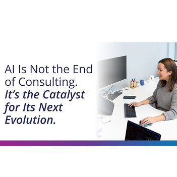
Every few years, the consulting industry is declared dead. First,...

Jan 13
Execution Over Optics: What Q1 Buying Behavior Is Revealing About...
Jan 8
Too often, execution is treated like a baton pass. Strategy...
Jan 8
The AI noise is deafening. Everyone’s got a new model,...

Dec 29
By now, every technology and business leader knows they need...

Dec 29
I’ve been in multiple boardrooms over the past year where...
Dec 23
Ask any CIO or CTO what they want in a...

Dec 19
The retail banking sector is approaching an inflection point. As...

Dec 19
Every organization I work with wants to move faster. Executives...
Dec 17
There’s a myth that legacy systems are a problem because...
Dec 12
Right now, boardrooms across the country are echoing with this...
Dec 12
Everyone in insurance loves talking about analytics, AI, and “data-driven...

Dec 12
Every conversation about insurance technology right now seems to lead...
Dec 5
I’ve spent the last decade watching insurance carriers chase the...

Dec 5
In November 2023, we published an analysis of Microsoft Fabric...
Dec 3
In Atlanta’s insurance and banking sectors, many PMOs are still...

Dec 3
There’s a pattern I keep seeing. Executives greenlight AI initiatives...

Dec 1
Everybody loves the promise of AI. Automate the grunt work....

Nov 26
Year-end reviews are in full swing. Revenue performance. Attrition rates....
Nov 25
Everyone wants to talk about AI strategy right now. Execs...

Nov 24
In large-scale transformation efforts, it’s easy to feel optimistic at...
Nov 20
The enterprise AI conversation is shifting. The early rush of...

Nov 19
In the race to modernize, governance often gets framed as...

Nov 17
Every fall, enterprise leaders across industries engage in the same...

Oct 27
This is not about slowing down. It’s about getting smarter...

Oct 25
Application development is often blamed for many modernization failures, missed...
Oct 20
The Long View: Why Endurance Beats Speed in Enterprise Modernization...

Oct 6
AI is everywhere in enterprise conversations right now. Boards are...

Sep 29
Most transformation programs don’t fail because of tools. They fail...

Sep 18
In enterprise technology, values are often treated as window dressing....
Sep 10
The Discipline to Pause What’s Working One of the most...
Aug 26
Great tech leaders are stepping away from the illusion of...

Aug 26
BY JESSE FORBES SENIOR CONSULTANT, APPLICATION DEVELOPMENT At Hylaine, we...
Aug 19
In high-stakes delivery environments, the instinct is often to tighten...
Aug 12
Too many executives are still defaulting to staff augmentation when...
Aug 5
Every CIO wants to move faster. But the hard truth...
Jul 30
We’re in an era where nearly every consulting firm promises...
Jul 28
Most transformation efforts don’t fail in design. They fail in...
Jul 25
Legacy technology is often viewed as a liability. But in...

Jun 25
A client operating in the home services and utilities market...
Jun 12
First, what is Organizational Change Management (OCM)? Organizational Change Management...
Apr 6
Many companies are rolling out their 2022 strategic plans in...